

Data: Look and you really shall find!
Data: Look and you really shall find!
Weird trends in England and Wales

Working with data is a bit like using a difficult painting medium, canvas and subject, with very poor light. You really don’t know what you are going to get until you start putting brush to paper, or data in to a graphic.
What might look conclusive in rows of figures, can suddenly look totally inconsequential in a chart. What you were expecting to appear completely normal, can have a wild card variation that puts a spanner in the works. There are thousands of different ways that data can be presented: logarithmically, to scale, reversing the timeline, swapping the axises, using excesses or totals, daily, weekly, monthly, annually etc. Where humans are concerned, by location, gender, age, country of birth, height, weight and so on.
Presentation is everything as we will see in this article. It can highlight or hide data according to the aims of the presenter.
Getting access to a broad and accurate range of data is critical to being able to assess the bigger picture, rather than looking rather myopically at a restricted dataset over a short period of time.
Excess Deaths
During Covid the standard measurement for how bad, or how good things were, was this slippery thing called ‘excess deaths’. According to the British Medical Journal ‘Excess deaths are calculated as the difference between current numbers of deaths and those in a baseline year, and the excess can differ depending on the baseline and methodology used’.
This form of measurement worked well in the beginning of the first Covid wave. What might appear only a little abnormal on a linear chart of total deaths, suddenly looked pretty dreadful against the previous five year figure for that week. And of course there was the weekend lag and sudden leap on a Monday afternoon, which made it look like all the deaths occurred on a Monday. Gives another meaning to Monday morning blues!
This chart for 2020 from the BBC was indeed alarming, but it seems that excess deaths from other causes over the same time period were even outstripping Covid 19. What were those other causes and why were they so high?

Of course the situation in Care Homes with patients being administered end-of-life drugs, and loss of access to treatments for conditions such as Cancer are thought, in some groups, to be the cause of this excess. We will look at age/death proportions in greater depth in the second article on Data.
Age Standardisation
The other method used for calculating rate of deaths is age standardisation. This was used during Covid by the Institute and Faculty of Actuaries. This allowed for weighting of death rates according to age, rather than counting every single death. The Office of National Statics used the number of deaths in excess of a baseline measurement for the period. Which means they found the lowest measurement for the week in the previous five year period and measured excess from there.
The Institute and Faculty of Actuaries also worked from a baseline, though it is unclear whether that was also age adjusted, and then age adjusted deaths were counted on top of that as an excess.
The example BMJ gives is that from February 2020 to 30 September 2022 the ONS counted 152 255 excess deaths from their baseline, and the IFoA counted 123 600 from their baseline. So we have two potentially different baselines of ‘normal death rates’ over a five year period, upon which excess deaths based on two completely different methods of calculation are added.
It is little wonder that nobody can really grasp what the reality of Covid was.
Below is the Chart of Weekly standardised deaths from 2012 – 2023 from the Actuaries Mortality Monitor. There is one big spike during the weeks of April in 2020, some dips where the holiday period creates a lag in reporting, some vague spikes in the winters of 2021, 2022 and 2023 and 2012-2019 is unceremoniously lumped together. We cannot tell an awful lot from this chart.

As 2021, 2022 and 2023 data has emerged, what was alarmingly abnormal in 2020 is beginning to look much more normal.
However, the problem with the use of a five year moving average is that we have completely lost sight of how things looked before Covid. Things appear to be getting much better, but are they really?
To work out what has really been going on we cannot take five years in isolation, we must look further back than that. It is also important to consider number of deaths according to total population. What proportion of people have died, from among our 67 million population not-so-neatly crammed on to our tiny island?
Linear total mortality 2000-2023
Whilst taking all the deaths together, without accounting for ratio to population, might seem statistically sloppy, what it can do is allow us to see trends. In this chart below each month of each year is lined up back-to-back with all the other months/years in sequence. This chart runs from 2001 to November 2023.

It seems fairly unremarkable at first sight, with two spikes in deaths in 2020 and 2021, which coincide with Covid 19.
But look what happens when we take the same chart and start counting from 30,000 deaths instead of 0 and stretch the chart out a bit from top to bottom.
It looks like a completely different chart. Because the 2020 spike is so large in the first chart, it drowns out much of the detail across the rest of the chart. These changes of focus, to above 30,000 deaths, and stretching out the bars, allows us to see detail we would otherwise not be able to see without deleting the monthly mortality data for 2020. Check the data starting point on all of the charts below.
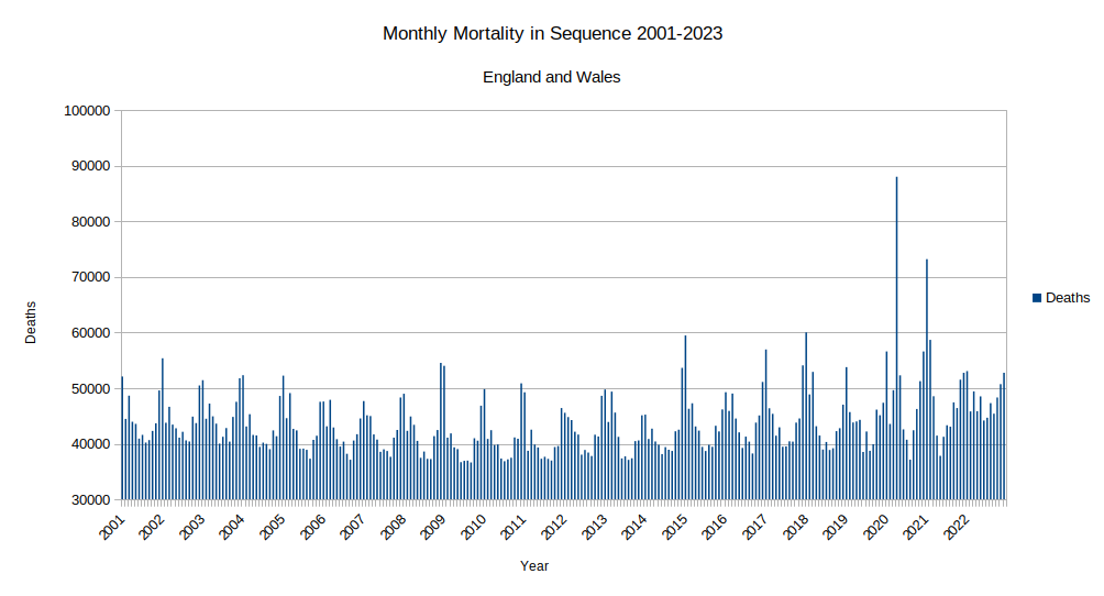
Below is the chart marked up in areas where there are significant spikes in mortality before Covid 19 ‘hits’. By adding an orange line at the lowest number of deaths across the range, in 2009, we can now see that there is a gradual curve in baseline death rates. The curve starts fairly high, above 40,000, in the summer months of 2001. This reduces to around 36,000 in the summer of 2009, rising again to a peak in the summer of 2017 and tailing off again.
Then we get a final big hike during spring/summer 2022 to around 45,000 deaths. 2022 was the year we had the heatdome, prolonged hot and stifling weather, poor air quality and multiple fires across England. Climate Change everybody - wink wink nudge nudge!

As spring/summer is traditionally the period where our health is at its optimum, flu season is over, we are spending more time outside and eating more healthily, this curve is quite interesting. It might tell us a lot more about what is going on around us, particularly in the environment.
Even more interesting are the distinct spikes in mortality during the winter periods. The lowest winter time mortality seems to be in 2014, the highest ‘Winter’ time mortality is in 2021, which is then preceded by an uncharacteristic spike in April 2020. Though if we look really closely at winter 2022, there is also high mortality but it is spread out more evenly across a period of three months.
There are a number of other winters with high mortality which don’t fit in to the ‘standard model’. 2002, 2003 & 2004 look low but the mortality is spread out over two months rather than one, 2009 has two high months of mortality. 2015 is very high, 2017 slightly less so, 2018 is high across a prolonged period of four months.
What was happening in those years in the UK and abroad? Were there wars abroad or epidemics or ‘storms’ at home? Have a look to see what you can find and put it in the comments below.
Population and Birth Rates
The overall population of England and Wales has increased nearly two fold since 1963 and the number of deaths proportionally has dropped in line with increasing life expectancy. Below is the chart illustrating the estimated populations of males and females of England and Wales over time. Quite a pretty chart! No surprises.
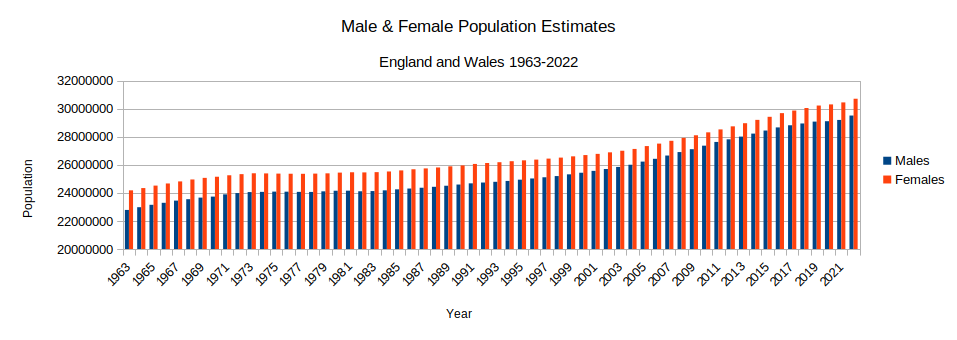
Consistently females outnumber males in the population, but that is not always the case. If we look at the estimated population of babies under one year of age in the chart below (1961-2022) we see that males outnumber females. This means that overall males are dying at a faster rate than females.

We also see something else quite interesting in this chart. It shows a generalised decrease in babies aged under 1 (birth rates and early infant mortality) of both male and female groups during the late 70’s, another slight dip in 1982-1984, a significant dip in 2000-2002 and yet again in 2021. These dips are not sudden, they are gradual and they also recover gradually. Also the general trend over time for births is in decline.
The 1990’s were tough for some economically but on the whole, the austerity thing didn’t kick in until 2010. If it was austerity related it took between 6-11 years to fully register with the population. Perhaps something else was contributing to these reductions in birth rates and increased early infant mortality. Take a look back on the history timeline to see if you can find what was happening at home and abroad that may have affected these figures.
Population versus Mortality

When we look at overall mortality per 100,000 the chart is also fairly unremarkable, with the exception of 2020, though we do start to see a leveling off and increases in the rate of mortality across the board from a low in 2011. Interestingly in the same year, 2011, the population of babies under the age of 1 reaches its peak and begins a gradual decline.
So after a prolonged period of decreasing mortality rates in England and Wales, despite a steadily increasing population, we suddenly see that trend starting to reverse. In this chart, which ends with Covid-19 in 2020, we can see that what happened in 2020 appears not to have been in total isolation. This is why looking at overall deaths, rather than ‘excess’ deaths, can be so much more revealing.
This chart shows us the trend in male to female mortality 1963 to 2020 per 100,000 males/females.
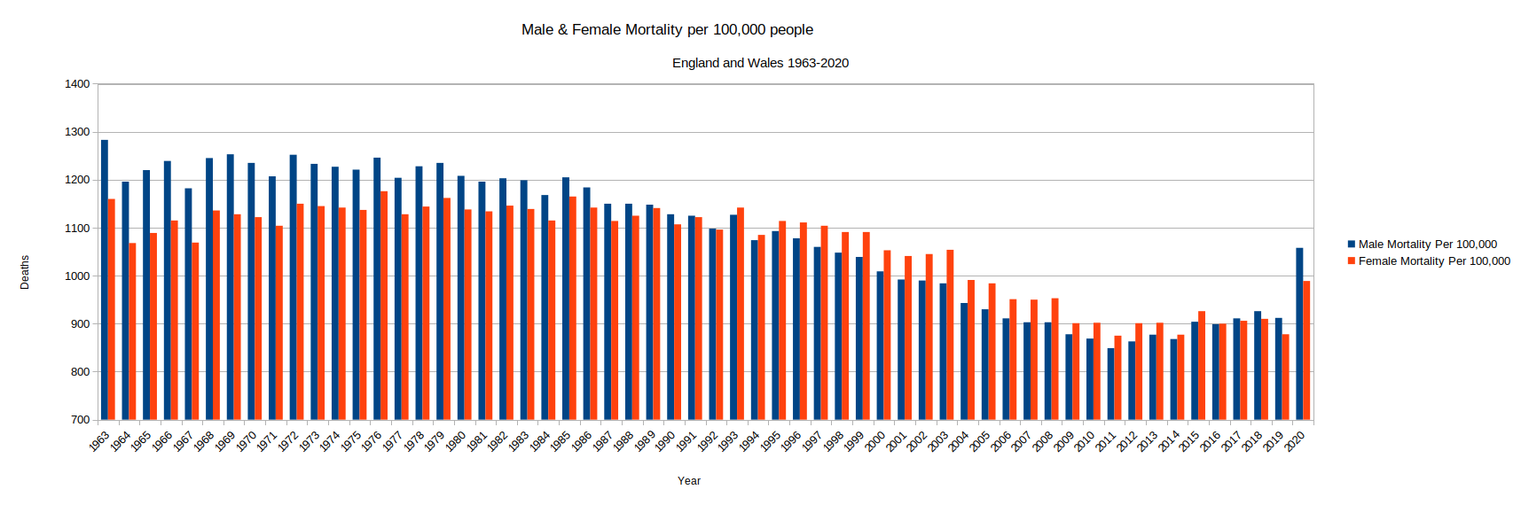
What is remarkable is the disproportionately high rate of male to female deaths in the period from 1963 to around 1988/1989. This is then dramatically switched in the early 1990’s to the rate of mortality in females being noticeably higher than males until we get to 2016. Rates then remain even for just one year and male mortality rates start to overtake again.
It would be totally acceptable to scratch our heads at this point. This anomaly is not, by the way, related to the higher population rate of females to males, as these figures are based on mortality per 100,000 not total mortality, so the standard measure for both is equal.
Why is there such a disparity? Until we pick apart mortality per age group, and then possibly, if the data is available, look at death rates for ages per disease/condition/event, it is impossible to say for certain.
What we have noticed in the nearly four years since Covid-19 crashed on to the global scene, is that pets, babies and young children seem to sicken in order of exposure to the elements, combined with size. We could apply the same logic to the size of adult females compared to males.
Death rates in males also seem to decrease steadily around the time that coal mines are gradually shut and a lot of UK manufacturing started to move abroad. Did the late 1980s/early 1990’s herald a different type of environmental threat? A threat that impacted females first, and future fertility, and are these effects only now starting to manifest in the broader male population?
There are many other parameters we could use to compare this data over time and in the next article we will look at trends in age related mortality for both males and females. If cause-of-death trends per age group are also available, it may be possible to identify the cause of this switch over.
Sources
Below are the ONS sources of annual population data, mortality data, and monthly mortality data.
Deaths Registered by single year of age
Fascinating.